
No products in the cart.

What is Responsive Design, and Why Does Your Business Need It?
Have you ever visited a website on your phone only to find that the text is too small, buttons are impossible to tap, and images appear distorted? That’s what happens when a website isn’t built with responsive design in mind. In today’s mobile-first world, ensuring your website looks and functions well on all devices is not just a nice-to-have—it’s essential.
Responsive design is a frontend web app development approach that ensures a website automatically adapts to different screen sizes, resolutions, and devices. Whether a user accesses your site from a desktop, tablet, or smartphone, the layout, images, and navigation adjust dynamically to provide an optimal viewing experience.
In this blog, we’ll explore what responsive design is, why it’s crucial for businesses, and how you can implement it effectively.
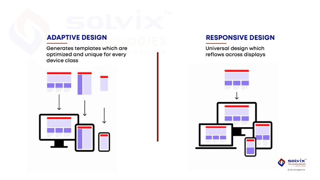
What is Responsive Design?
Responsive web design (RWD) ensures that a website automatically adjusts to different screen sizes without compromising usability or functionality. This adaptability is achieved through:
- Fluid Grids – Instead of fixed-width layouts, elements are sized proportionally so they resize dynamically.
- Flexible Images – Images scale within their containers, preventing distortion or overflow.
- CSS Media Queries – Specific styles are applied based on screen size, ensuring an optimal layout for every device.
For example, a multi-column desktop layout may transform into a single-column view on mobile, making navigation smoother. This adaptability enhances user experience (UX) and search engine rankings—both critical factors for any business website.
Top Tools for Creating Mobile-Responsive Web Applications
Developing a responsive frontend requires the right set of tools. Here are some of the most powerful frameworks and resources used by developers:
1. Bootstrap
A widely used CSS framework featuring a 12-column grid system, responsive utilities, and pre-designed UI components. It makes creating mobile-first websites effortless with minimal coding.
2. Tailwind CSS
A utility-first CSS framework that enables developers to design responsive layouts quickly without writing extensive custom CSS. With predefined classes, you can set styles directly in HTML, making responsiveness easier to manage.
3. Google’s Mobile-Friendly Test
A free tool that analyzes whether a website meets Google’s mobile responsiveness standards. It highlights potential issues like text readability, tap targets, and viewport settings, helping improve SEO rankings.
4. Figma & Adobe XD
These design tools help UI/UX designers create responsive wireframes and prototypes before development begins, allowing teams to visualize how a site will adapt to different screens.
5. CSS3 Media Queries
A core CSS feature that allows developers to apply styles dynamically based on device width, height, resolution, and orientation, ensuring websites adjust fluidly.
6. React & Vue.js
Modern JavaScript frameworks that enable component-based UI development, ensuring smooth responsiveness across different screens.
7. Lighthouse (Google DevTools)
A powerful auditing tool that evaluates a website’s mobile responsiveness, performance, accessibility, and best practices, offering insights for optimization.
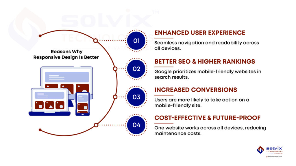
Key Benefits of Responsive Design for Your Business
1. Enhanced User Experience (UX)
A well-optimized, responsive site ensures seamless navigation and readability across all devices. Users stay longer, engage more, and are more likely to return—leading to higher conversion rates.
2. Improved SEO and Google Rankings
Google prioritizes mobile-friendly websites in search rankings. Since over 60% of global internet traffic comes from mobile devices, Google’s mobile-first indexing means that if your site isn’t responsive, it risks lower visibility in search results.
3. Higher Conversion Rates
A frustrating mobile experience can drive visitors away. Research shows that 57% of users won’t recommend a business with a poorly designed mobile site. Ensuring smooth navigation, readable text, and fast loading times significantly boosts engagement and conversions.
4. Cost-Effectiveness (One Site for All Devices)
Maintaining separate desktop and mobile versions of a website is expensive and inefficient. A single, responsive website reduces development and maintenance costs while ensuring a consistent brand experience across platforms.
Responsive Frontend Development in Canada – Why Location Matters
If you’re looking for frontend development in Canada, choosing the right team ensures your website meets modern web standards. Canadian businesses need to stay competitive in an increasingly digital landscape. Investing in local expertise ensures compliance with best practices and consumer expectations in the region.
Canada has one of the highest mobile penetration rates globally, with over 33 million active mobile internet users. This makes responsive web design an absolute necessity for businesses targeting local consumers.
How to Get Started with Responsive Design
If your website isn’t yet responsive, here’s how you can begin:
1. Consult with Experienced Developers
A professional frontend development team can help assess and redesign your site to ensure optimal mobile usability. Businesses in Canada should prioritize working with experts in frontend web app development in Canada to align with local market trends.
2. Adopt a Mobile-First Approach
Designing for smaller screens first ensures that essential elements function well before scaling up to larger devices.
3. Test Across Multiple Devices
Regularly test your website on various devices and browsers to identify responsiveness issues. Use tools like Google’s Mobile-Friendly Test or manually test on different screen sizes.
4. Optimize Performance
Page load speed is crucial. Compress images, minimize unnecessary scripts, and use lazy loading techniques to ensure smooth performance on all devices.
Conclusion
Responsive design is no longer optional—it’s a business necessity. A mobile-friendly website ensures better user experience, improved SEO, and higher conversions while reducing maintenance costs. If your website isn’t responsive, now is the time to upgrade.
Looking for frontend development in Canada to make your website fully responsive? Contact our team today to build a modern, mobile-friendly site that keeps your business ahead of the competition.